Planet Telecom
This success story marks the beginning of Planet Numbers’ journey towards achieving brand alignment and setting the stage for a comprehensive digital strategy overhaul. At this initial phase, our focus has been on laying a solid foundation by enhancing our visual identity, refining our SEO approach, and embracing targeted marketing to set the course for future growth. Key initiatives have included:
- Modernising the logo to better reflect our brand values.
- Introducing the ‘Astrodude’ mascot to differentiate our brand.
- Launching segmented campaigns aimed at engaging specific audience segments more personally.
These steps have been crucial in addressing past challenges, ensuring our brand elements are consistent across all digital platforms, and enhancing the user experience on our landing pages. While this marks a significant milestone in aligning our brand with our innovative services and boosting engagement and leads, it’s just the start.
Original Findings
The audit on Planet Numbers uncovered several critical areas for brand enhancement: Visual Branding Update: We identified the need to modernise visual elements to better represent the dynamic telecom services.
- Content Diversity: Highlighted the importance of offering more varied and informative content
- Website and User Experience: Recommended improvements in navigation and interactivity on the website.
- SEO and Digital Strategy: Suggested stronger SEO practices for improved online visibility and targeted ads.
- Service Productisation: Advised on packaging services into marketable offerings for easier customer understanding.
- Character Uniqueness: We noted stock character imagery detracting from brand uniqueness.
The Challenge
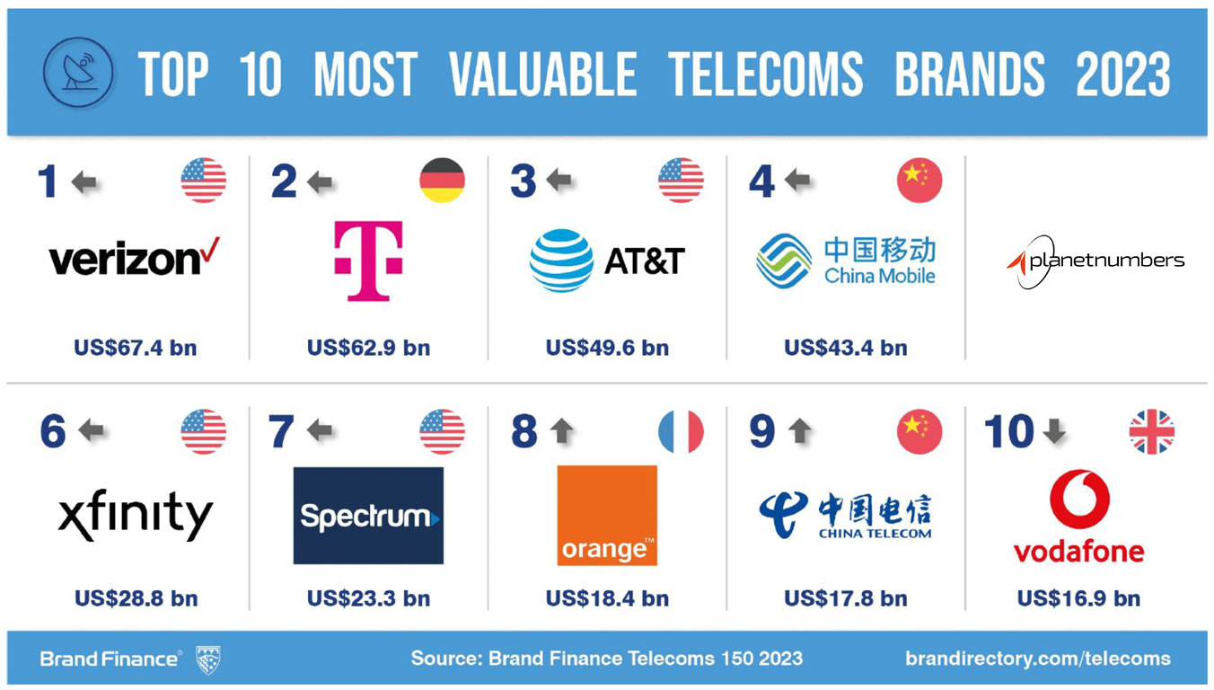
The logo of Planet Numbers, as seen on their website, plays a crucial role in representing their brand identity. While the Planet Numbers logo appears functional in its simplicity, there was opportunities to enhance its impact through careful consideration of color, font weight, design, and its representation of the brand’s core values and services.
Our Recommendations:
Re-evaluate Color and Design: If the current colours or design elements do not strongly convey the brand’s values or appeal to the target audience, consider a redesign or refinement. As you can see the logo does not redu
Enhance Versatility: Ensure that the logo is adaptable for various uses and sizes without losing its impact or readability. Consistent Branding: Regularly audit all platforms to ensure the logo is used consistently and is in line with the current brand strategy.
As you can see the logo does not reduce down clearly compared to industry creates
The Solution
We updated the Planet Telecoms logo to make it look more professional and to make sure it still looks good when it’s small. It was to feel honest and dependable to match our brand and appeal to our main customers—men aged 18-54 from different social classes.
The new design would be simple and clear, using an artistic style that shows what they are about. We used the color Tangerine to bring out the lively and forward-looking approach and blue to reinforce trust and reliability.
The new logo will better represent our dedication to being straightforward and high-quality.
Astrodude
The journey to the final brand ambassador, Astrodude, began with various preliminary ideas. Each iteration brought us closer to a character that genuinely resonates with the ethos—combining a sense of adventure and friendliness with a commitment to professional excellence. These initial designs laid the groundwork for a distinctive mascot and were deeply reflective of the forward-thinking and customer-centric approach of Planet Telecom.
The creation of Astrodude, the bespoke mascot, marks a pivotal evolution in the brand’s visual identity. Stepping away from generic stock imagery, Astrodude embodies a unique, engaging character that captures our brand’s essence: friendly, approachable, yet underpinned by a professional ethos.
This distinctive, custom-designed astronaut becomes a symbol of the innovative spirit and commitment to personal, yet expert service, ensuring strong brand recognition and a memorable presence in the industry.
Improving Brand Recall
The attached examples show that brand alignment across various platforms is crucial for establishing a cohesive and recognisable identity. It ensures that customers receive a consistent brand experience, whether they interact with the brand on social media, websites, or offline materials.
This consistency not only aids in building trust and reliability but also reinforces brand recall, making it easier for customers to remember and choose the brand over competitors. It’s a strategic approach that unifies all marketing efforts, amplifying the brand’s message and values across every touchpoint.
Landing Pages
On our landing pages, we’re engaging in multivariate testing to determine which brand image resonates more effectively with our audience—the energetic orange or the professional blue.
This testing is crucial to optimise user experience and brand perception, ensuring that our visual identity aligns perfectly with our customers’ preferences and our brand values.
Through careful analysis of engagement metrics, we will refine our branding to serve our users better.
Social Ads
In the ever-evolving digital marketing landscape, the power of personalised, audience-centric campaigns has never been more apparent. Our strategic pivot to segmented targeted campaigns, moving away from Planet’s one-size-fits-all advertising model, has amplified our engagement rates and conversion metrics. Central to this approach has been the vibrant reinvigoration of our brand identity, spearheaded by the dynamic ‘Astrodude’ character, which has a memorable visual charm in our assets.
By directing each uniquely crafted campaign to segment-specific landing pages, we’ve not only heightened the relevance of our messaging but also improved the user journey, fostering a more personalised and engaging experience for each potential customer.
This systematic, data-driven approach underscores our commitment to innovation in social advertising, setting a new benchmark for precision and effectiveness in reaching diverse audience segments.

